Sunday, September 30, 2007

The Book as Art


A new reader in Spain voted for a post about The Book as Art. And since she has one of the most delightful bibliophiliac websites I've seen in a while: Imatges i Paraules (where my lack of Spanish literacy is no impediment to enjoying her wonderful images of books, readers, libraries, artist's books etc) I can only oblige.

Judging The Book as Art by its cover will not lead you astray. It's a beautifully designed and case bound hardback of a manageable coffee table size i.e. possible to hold comfortably for reading in bed, not just leaning over the coffee table. The red cloth with gold embossed lettering is enlivened with a photograph of one of the most intriguing artist's book featured inside the covers.

This is not a 'how-to' book but a museum catalogue highlighting books held in the collection of the National Museum of Women in the Arts. Each featured book is illustrated by one beautiful photograph (occasionally two) and a short statement by the artist. This is the book's only shortcoming: very few artist's books are so simple as to be satisfactorily illustrated with a single still photograph. This limitation is theoretically somewhat overcome on the National Museum of Women in the Art's website where, if you have broadband, you can use a page turning tool for view multiple views of each book. My laptop took hours to open each high resolution photograph* so I returned instead to the hard-copy book.

The range of books provides a good overview to the broadest definition of what constitutes a book... from lavishly illustrated conventional codex structures to fanciful sculptures; from all text to all image; with pop-ups, prints, silhouettes, paint and assemblage; from comedy to tragedy and from sublime to mundane; there are books to delight, challenge, comfort and pique.

I found many of the artist's statements worth studying as closely as the photograph of their work. The statements make me wonder if perhaps book artists tend to be more articulate in writing about their work than many other artists who might have developed their visual language skills at the expense of fluent writing. I don't know, but anyway, this is as much an art book for reading as for looking at the pictures. And the three essays (by the curator and two famous book artists) that introduce the catalogue both continue the theoretical conversations that I follow on Bookarts-List and share personal stories of lives immersed in the book arts.

Rich and stimulating fare. I've borrowed The Book as Art from the ABC library but I think I would like to have a copy of my own, if anyone was starting to wonder what to give me for my birthday in 2 months time.

*which is why the picture is from Imatges i paraules not NMWA

Friday, September 28, 2007

Wellington Magnolia


The first nomination for Magnolia of the Year has been received from E.
Nominations are still open,
despite the magnolia flowers being replaced by leaves in Whangarei already.

Send me your magnolia photos please!

Thursday, September 27, 2007

Learning Curves

Talking with my mother this evening I realised that in both my paid work and my creative work I am immersed in hugely steep learning curves. I spend six days a week in intensely challenging and rewarding learning environments.
In both the planning office and the print studio it feels like there are quite high stakes riding on my ability to learn fast and produce high quality work. No wonder I've been quite tired and a bit cranky lately.
Sometimes I just don't have the energy to wax lyrical about the good things I've experienced and even less energy for finding a good humoured irony to describe the inevitable disappointments and challenges of working at outer edge of my abilities. Sometimes I have to fall back on my policy of 'if you can't write something positive, beautiful, witty, informative or hopeful then don't write anything'. Sometimes blog posts never leave my imagination or have a chance to expand out from a scribbled sentence in my journal.
Just so you know I may or may not get round to posting about:
  • an account of my visit to NorthArt Gallery and the Bookworks exhibition which is on in Northcote, Auckland until 3 October.
  • the story of the runaway Ossi cat (now returned to the lap of luxury and catnip treats)
  • a review of The Book As Art, my pick as the book-about-artist's-books book of the year
  • the full body book I'm working on
  • the paper bag proof subscription series
  • my new mp3 player (another steep (though short) learning curve but so very very good)
  • Spring Cleaning Day at TKPT (7 October, do come along and help if you are in town!)
  • Deep Economy, electric cars and sci fi novels
  • local body elections
  • Magnolias, kowhai and port wine trees
If you like, you can use the comments function to vote for which of these posts you would most like to read, which might help motivate me to write it.

Thursday, September 20, 2007

An infinite capacity for taking pains

"Perhaps the essential quality desirable in a compositor* is an infinite capacity for taking pains, whatever kind of work is to be done." (Chapter 1: The Qualifications of the Compositor)

"The young compositor eager and anxious to make good progress in mastering the technique of his (sic) craft is often in the position of "attempting to run before he is able to walk". (Chapter 2: Composition)

"Unfortunately, and short-sightedly, many employers (or their overseers) appear to believe that the young student-apprentice will be happily engaged for week after week on clearing. This is by no means true; rather does the apprentice begin to wish he (sic) had never seen a composing room - and this is understandable." (Chapter 9: Clearing and Distribution)

"The accuracy of all type calculations depends largely on an intelligent analysis of the copy and any deviations required thereby, together with an alert perception of the relative differences between type founts, the space to be occupied by setting matter in different styles, and the judicious allowance for correct grouping and spacing throughout the work." (Chapter12: Case-Room Calculations (3))

From Printing Theory and Practice 2: Compositors' Work. Charles L. Pickering. (Sir Isaac Pitman and Sons Ltd: 1948)

Thank you, Mark, for sharing this lovely little book!
We'd love to see the others in the series: Bookwork, Compositors' Equipment, Typographic Design etc.

* A compositor is one who does composing or type-setting with movable type.

Sunday, September 16, 2007

More printing metaphores, and some tangentially related photos

Printing creamy white, Incisioni 350gsm 50% cotton paper, light and white and foamy and stiff as a Pavlova. A Pavlova is bland until scattered with dark rich fruit sinking into the whiteness- it is the contrast of sweet and tart, of soft/crisp/creamy/chewy that makes the Pavlova so very, very good. And until the paper takes a print it is waiting to become irresistible. Once printed, my mouth waters: I want trace the impression with the tip of my tongue and taste the sweet tang of words made tangible.

The verso side taking the soot-black ink like a feather pillow accepting a dreamer's head.


The recto side the merest judder of texture, like snow blown into shallow ridges, then frozen to a thin crust.

Wednesday, September 12, 2007

In which I compare printing to chocolate

The other day I was doing a bit of surfing/research into the printing press at Pompallier House in Russell. I have written about Pompallier House before, when I visited there a couple of years ago. Since starting to make my letterpress dreams come true, one of my persistent fantasies has been to print on the much older flatbed Gaveaux press at Pompallier.

So when I found this web page, about a couple of Wanganui printers and book artists who did just that earlier this year... well, I was simultaneously excited to read about their project and jealous that they did it first and relieved that they've paved the way (presumably) for other printers to follow.

Anyway, I printed out the webpage (first pasting it into a Word document for elegance and efficiency) on the big colour laser printer at work. I showed the printout to one of my posse of retired printers and rather than comment on the content of the article or the illustration of the Gaveaux press, he admired the quality of the digital printout. This man has spent his working life printing through at least three massive revolutions in technology. He spent his career working hard to make the most crisp, clear and consistent marks paper possible with whatever machines were available.

On the other hand, in my working life, the perfect reproduction of a digitally designed page is something that I take for granted. I notice digital printing just enough to be aware of the mismatch between its high quality (and high resource use) and the mundane and ephemeral uses it is most often put to in the office.

And when it comes to reproducing my own creative writing, I devalue digital printing compared to letterpress. When I think of digital printing as flat, I'm not just referring to the way the ink sits on top the paper. To me, there is something lifeless and empty about what is spat out from the black box of a digital printer. Laser printing, ink jet, photocopying, even offset- they all seem to lack the texture and energy and life of letterpress printing. These are the M&Ms of print- superficially appealing and of utilitarian value but ultimately unsatisfying in their physicality.

Fine press printing, where master craftsmen patiently apply the fruits of centuries of accumulated expertise to well-tuned machinery to produce an exquisite balance of ink, paper and pressure is like the cabinet of a Belgian chocolatier- the pinnacle of the craft. Since I have had little direct experience of either fine press printing or Belgian chocolatiers, these remain the stuff of my lottery-winning daydreams.

The letterpress I am making at TKPT is grainy and sweet, like homemade fudge. My experiments and accidents produce results that are sometimes sublime and sometimes rubbish (just like my fudge). I have learned to love the inconsistencies and irregularities of text that is born of the marriage of my inexpert enthusiasm and the well worn type I use. While it is always satisfying to pull something approximating an ideal print, it is just as delicious to find beauty in the qualities my teachers and textbook try to avoid.

Monday, September 10, 2007

The Toolbox

Terry Fleming, one of my posse of retired printers, gave me his journeyman's toolbox last week. I almost burst into tears, overwhelmed at such a generous, thoughtful, incredibly useful and appreciated gift. I feel so honoured.

The best thing in the toolbox is the quoin key- regular readers will be familiar with my pining for this implement. It's a dream to use. Another treasure is the micrometer which is a remarkable instrument for measuring infinitesimal lengths to ensure all the printing surfaces are type high and the same height. I haven't quite got the hang of that one yet, just as I am still struggling to get comfortable and competent with the printer's rule and measuring in ems. It's a big leap from millimetres especially for a near math phobic like myself.

The Arab press is looking very flash these days, since David Golding cleaned the rollers and made a new tray. I had no idea that the rollers were actually pink and green matte rubber not shiny black from years of not being cleaned properly.

But despite all this freshening up of the platen jobber I spent the weekend on the proofing press working towards my next book: Do the Dishes. One project was proofing the longest page of text. The book's pages will be die cut into circles and I'm trying to justify the type to echo the curve of the page. It was tricky, but with Jim Morrison's expert coaching the last proof looks perfect and I will start printing the edition (of ten) on the platen next Friday.

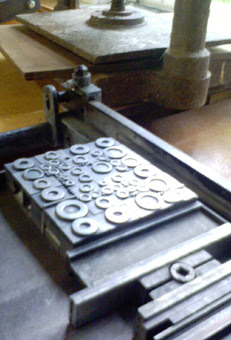
My other weekend project was printing a background pattern for the book's cover using the upper and lowercase 'o's of about 7 different typefaces arranged in a block on a galley. I've come a long way in terms of technical skills since my previous attempts to print unlocked type on a galley. This time it was pretty much effortless to pull a good print. The idea was to evoke bubbles, but it looks more like a retro curtain design from the 1950s. Square matrices inevitably make for a grid-like pattern and there is no way to get the circles all bumping up like bubbles. But I really like how it looks and I am quite happy for a such a modernist-looking design to be on the cover of the book. Realistic bubbles might have been a bit too naff. Paper bag proof subscribers can look forward to some very groovy bags with this design on it.

Friday, September 07, 2007

The Wild Green Yonder


One of my oldest and dearest Fish Club friends is launching her new book The Wild Green Yonder next week. Check it out!

While Philippa was WWOOFing* her way around New Zealand a few years ago I was one of the lucky people getting her occasional group emails (if she was doing it now she'd probably be blogging). They were facinating, inspiring, funny, sweet and addictive. And now she's written a whole book about the experience of two and a half years volunteering on organic farms.

Kim Hill is interviewing Philippa tomorrow at 11am on Radio New Zealand National. And if you miss that, you can read an article by Philippa about WWOOFing in the travel section of the Sunday Star Times.

*I always thought WWOOFing was the verb for participating in willing workers on organic farms, but it might be World Wide Opportunities on Organic Farms. Don't know, doesn't matter, same difference, you get the idea etc.

Sunday, September 02, 2007

Die cutting with the Arab and Advisors

Is there no end to the marvelous talents of the Arab press? On Friday I finally got to try die cutting, and it was as successful and easy as one could hope for. Die cutting is where a shaped blade is set into the chase and used to cut paper in the same way that the press prints- instead of ink marks on the paper you get crisp clean cuts.

I've been working towards this new trick for a few months. The most time consuming thing was figuring out how to get a platen sleeve to protect the platen from the sharp blade of the die. Many conversations with the various chaps who are my loose and informal advisory board eventually emboldened me to commission a sleeve from a metal work company in town.

I don't know if my advisory board fully appreciate what a cultural leap it was for me to get a part machined to my specifications. I can't think of anyone in my family or any woman of my acquaintance who has ever done such a thing. When I ventured to the industrial area of town and picked up the finished platen sleeve from a grungy workshop on Port Road I felt the kind of trepidation that I feel visiting a foreign country. The satisfaction of seeing how sweetly the sleeve fits the Arab was like that of completing a successful negotiation in pidgin and sign language in a foreign market. For extra affirmation, my advisory board members have all been very impressed with the sleeve and it is still so new and shiny that even a casual passerby would have to think it rather special.

Then the ever generous Murray Inder gave me a couple of oval die forms that he doesn't need anymore so the Arab's first cuts (in this phase of its career anyway) were egg shapes. When I come to a particular die cutting project (and there's one coming right up) I can either borrow a die, if Murray has a suitable one, or get one made any shape I want. But the ovals were just right for figuring out how to do it.

The rollers have to come off the press when you are die cutting (otherwise the rollers would get shredded by the blades) so that was to be my next thing to figure out. But then David Golding showed up on Friday morning, having made a beautiful new (oak?) tray for the Arab (the old tray was broken and even an old repair job had broken long before I ever saw it). David is one of several retired printers who contacted me after the Arab and I featured on the front page of the paper a few weeks ago, and he is fantastically helpful. He offered to take the Arab's rollers away and clean them properly (apparently they are too shiny to hold ink properly) while I had a go at die cutting.

He also explained why the die forms were covered in rubber. In my ignorance I had imagined the rubber was a removable protection to stop the blades getting damaged in storage. But no, the rubber provides a springy resistance so the paper doesn't stick to the die form but is pushed back to the platen after it's cut. Lucky he told me that before I started trying to get to rubber off!

With all the necessary elements in place I set about my usual trial and error approach to extending my printing skills. There was nothing about die cutting in my new bible, General Printing, a 1950s text book that my dad gave me recently but common sense goes a long way in printing. My recent lessons in make ready (placing bits of paper behind different parts of the form or platen to ensure an even pressure) were fresh in my mind so I was able to progress steadily towards cutting a complete egg in one kiss of the die to the paper. My number one coach, Jim Morrison, showed up just as I achieved this so I was able to show off to him.

We spent a happy few hours fine tuning the lays and make ready to produce lots of lovely creamy eggs.